Composing a photograph includes eliminating the irrelevant   


Years ago the Hasselblad camera company published a series of photography pamphlets. While I had my Hasselblad I collected and studied the information contained in them.

Recently I thumbed through one titled “The Eye, The Camera, The Image”.  Although meant for medium format film cameras it’s filled with information that is still appropriate for digital camera users.

I skimmed over topics like Using the focusing hood magnifier, Colour film and colour balance, Types of exposure measurement, Double exposure and Polaroid film, all are interesting reads if one is concerned with photographic history, however, not practical or useful for those searching to be a better photographer in our modern digital age.

However the topic, “We see far to much” caught my attention and it said,

“The eye is our organ of sight. It’s lens has a focal length of about 17mm and covers a 150-degree vertical and 120 degree horizontal field; the binocular vision provided by our two eyes gives a 180-degree angular field. We seldom have any need for images encompassing so wide a field. The wealth of detail in such a field would be rendered small and insignificant when reduced to images formed in a camera when composing a photograph outdoors or elsewhere. We always need to crop our field of view.”

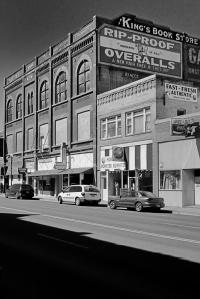
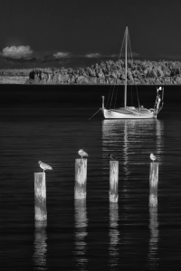
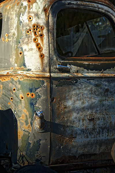
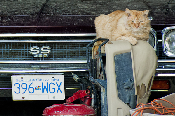
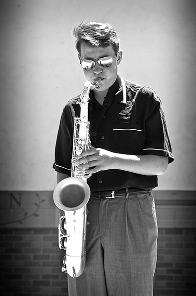
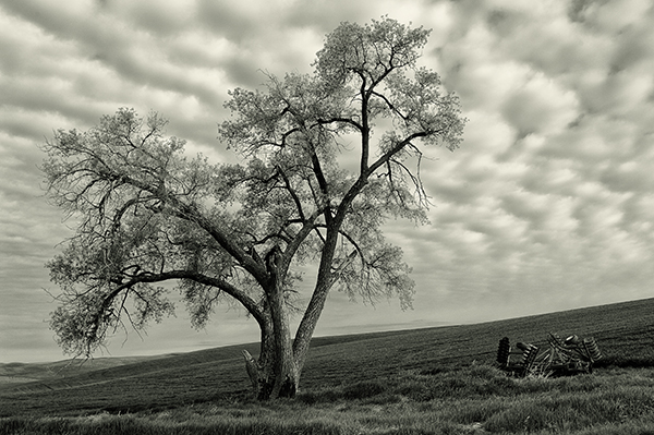
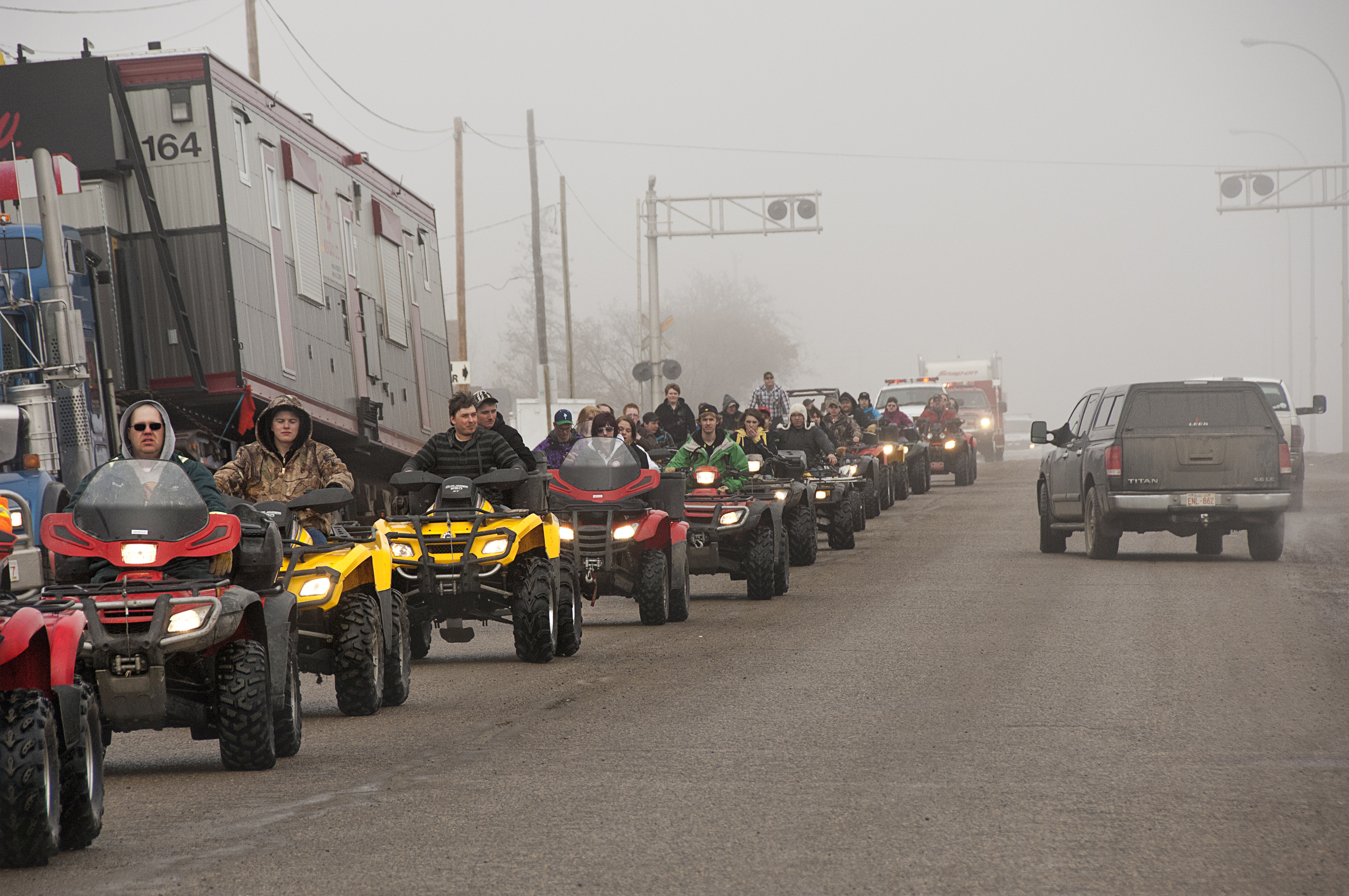
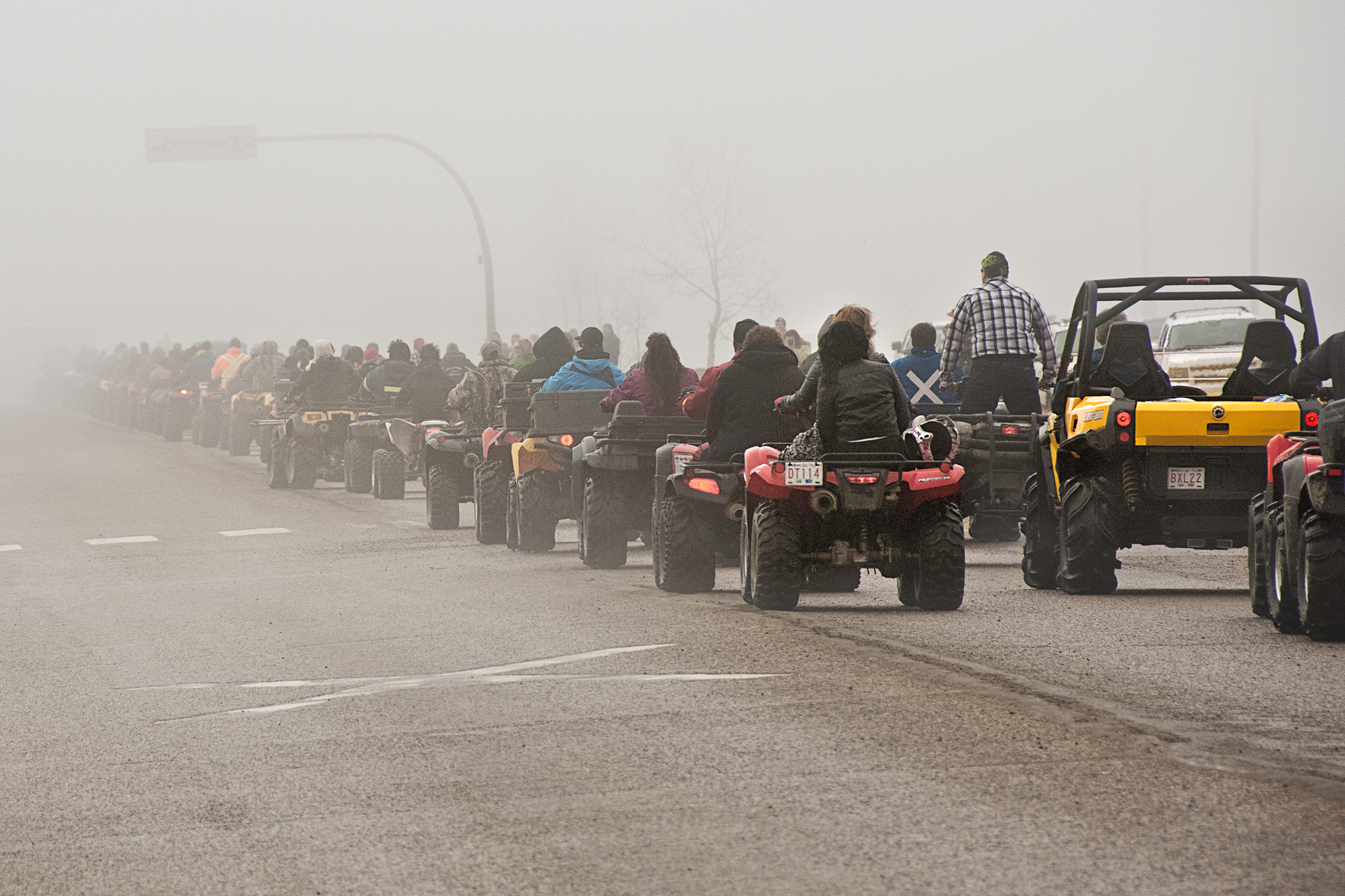
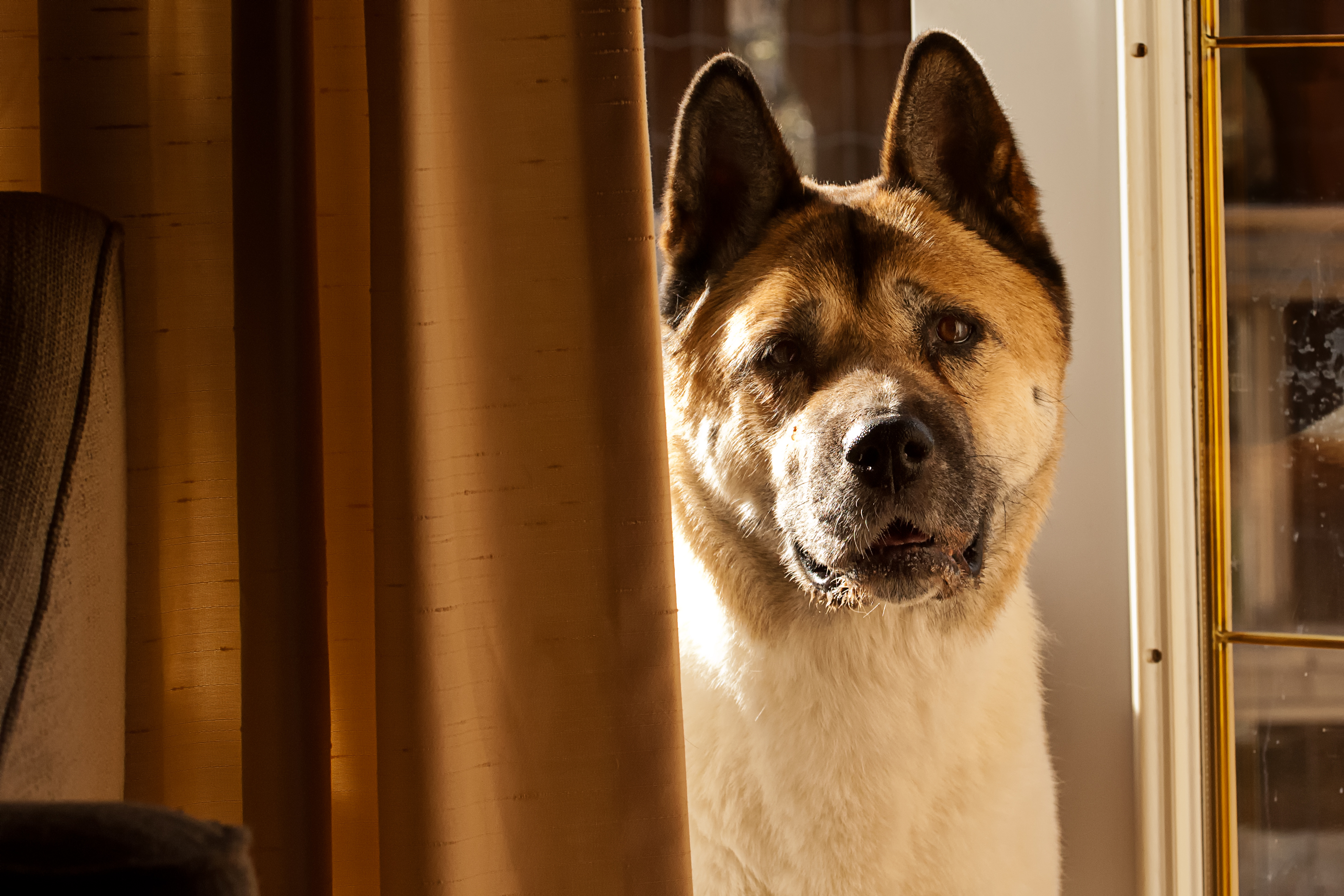
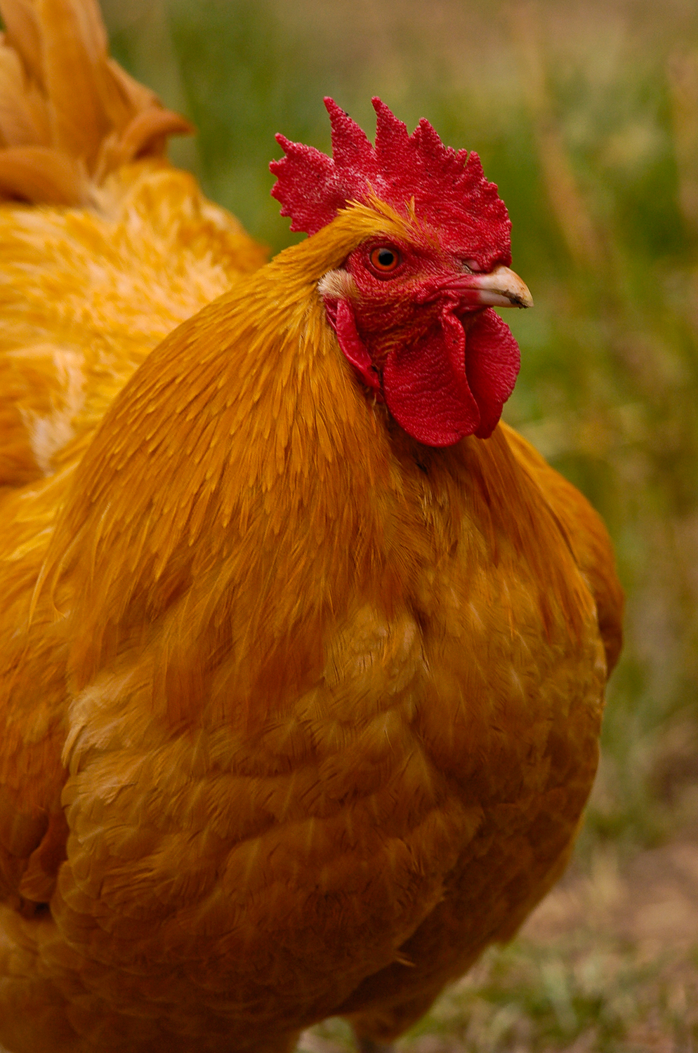
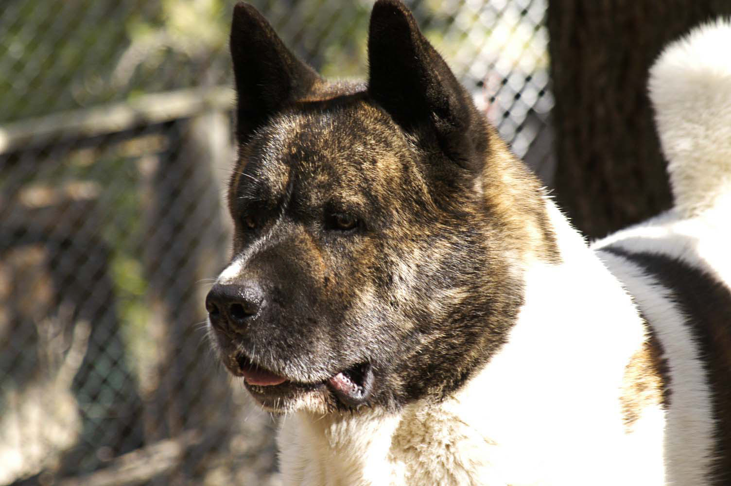
In my experience, most successful photographers want to “tighten up” on their composition, by that; I mean they only include those elements that add to the visual discussion of a photograph. Beginners are apt to aim with only the excitement of their subject in mind and don’t pay attention to other additional features captured by the sensor.

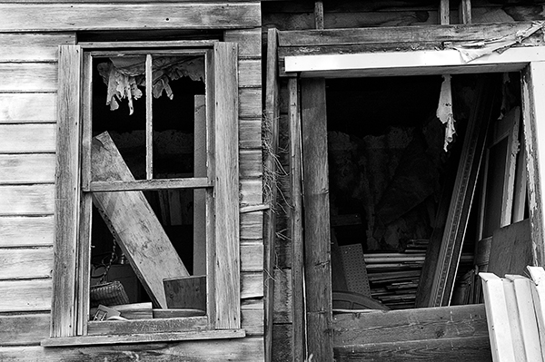
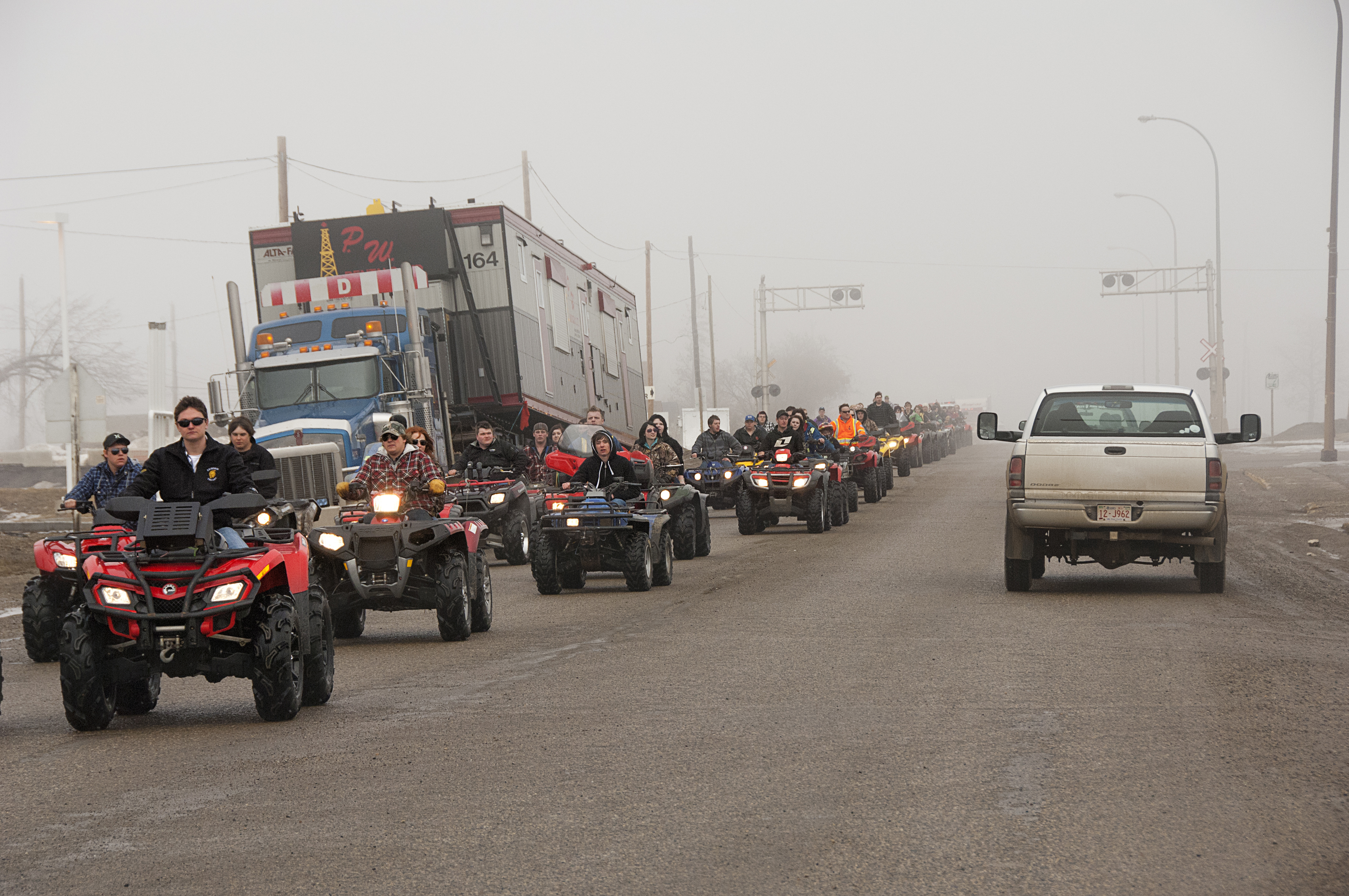
Photographers printing or posting their photos are surprised when they look and find a picture filled with irrelevant and disruptive items they wished they hadn’t included.

Hasselblad continues, “This elimination of irrelevance is vital. The trick often involves excluding most of what you see. Making a selection is a basic feature of all art, whether it is painting, drawing or photography. Art consists of picking out the most interesting, most illustrative, most instructive, the loveliest or most emotional components among a myriad of components in a subject.”

Photographers should train themselves to be specific with a subject, only showing the viewer what is important. How do we slow down to do this in an age of auto focus, auto aperture and rapid-fire shutter release? I have an easy answer – get a good tripod!

I know many photographers have never owned or used a tripod and some have only experienced rickety, inexpensive models. Using a sturdy, well-made tripod makes one slow down and pay attention to the subject in the viewfinder or LCD. In addition, the process of setting up the tripod and attaching a camera gives photographers time to think about composition.

I agree with Hasselblad’s contention that “we see far to much” and need to eliminate irrelevant items in our photos.

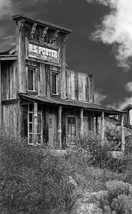
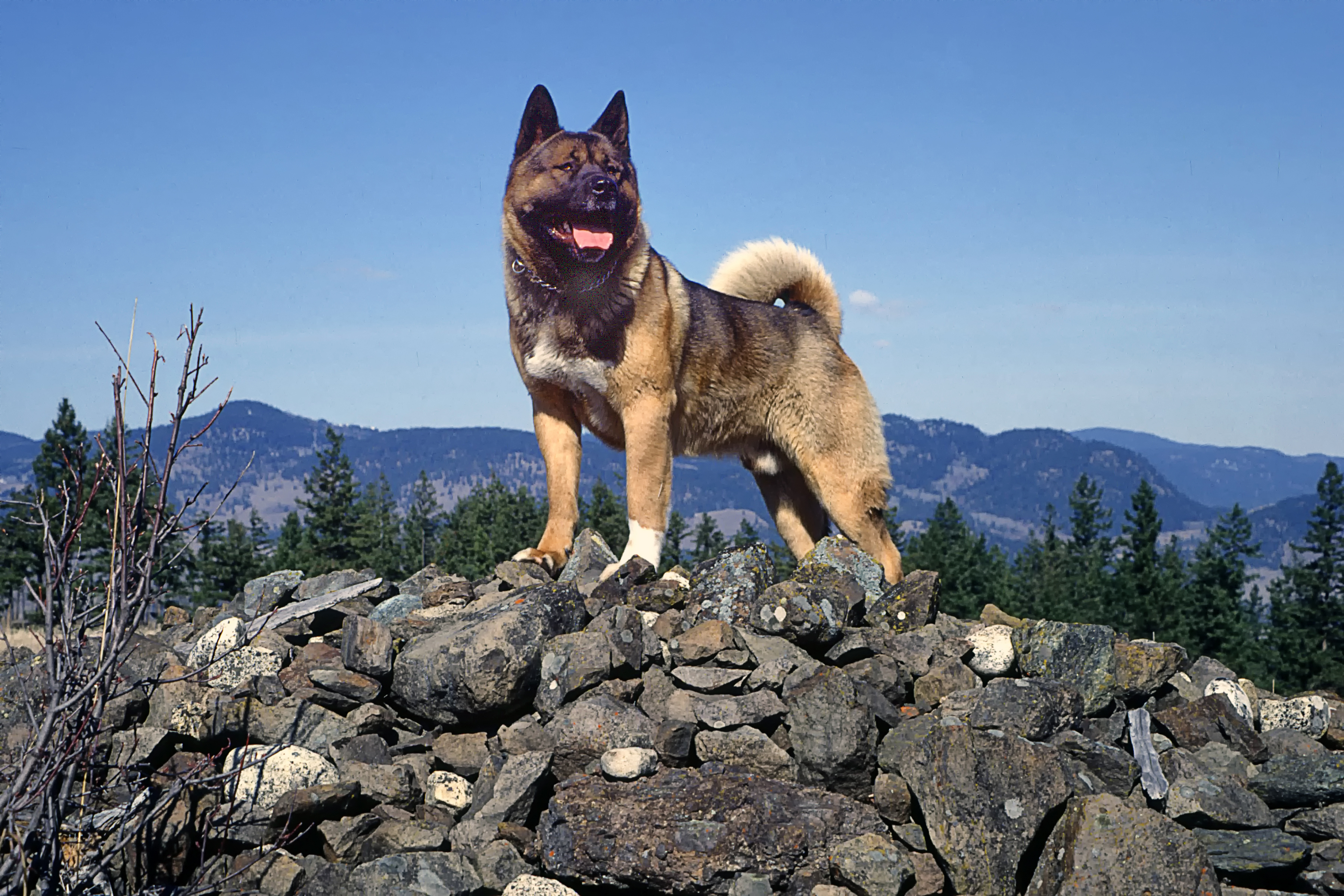
When an interesting subject is seen, stop the car and get out. Don’t be lazy and merely hunker down against the window to take the shot. Get that sturdy tripod out of the trunk; and as you do that think about, or “previsualize”, the photograph about to be made.

Set up the tripod, attach the camera and look through the viewfinder. I suggest making several shots starting from a narrow, limited view and zooming the lens out to a wide-angle view. That way there will be several choices for that picture.

Normal
0

false
false
false

EN-US
JA
X-NONE

/* Style Definitions */
table.MsoNormalTable
{mso-style-name:”Table Normal”;
mso-tstyle-rowband-size:0;
mso-tstyle-colband-size:0;
mso-style-noshow:yes;
mso-style-priority:99;
mso-style-parent:””;
mso-padding-alt:0in 5.4pt 0in 5.4pt;
mso-para-margin:0in;
mso-para-margin-bottom:.0001pt;
mso-pagination:widow-orphan;
font-size:10.0pt;
font-family:”Times New Roman”;
mso-ansi-language:EN-US;
mso-fareast-language:JA;}

To sum up, eliminate those elements inconsequential to the picture and compose for only those items important to the final photograph, not by looking at the subject and snapping away in a hurried fashion to include everything seen in the viewfinder, and take my advice, use a tripod.

Photography lessons with Black And White Film 

5-flower

port-view

rip-proof-overalls

seagulls-and-boat-2

deadman-junction-building

windowpane

I have recently been talking with many photographers that are very interested in the process of black and white film photography. Most had their introduction to photography in high school using film and although they moved forward to iPhones and digital cameras, they were pulled back to film by memories of the unique “hands-on” experience they had with film.

With all that interest I thought I would revisit an article I wrote in June 2014,  “What I Learned About Photography by Shooting with Black /White Film”.

I began using black and white film because it was cheap and it’s what we used in my first college photography class. After I began to understand the medium as being creative instead of just a way to records things, I grew to like B&W and for years refused to shoot with anything else.

With film, once the camera’s shutter was released what one got was, well, what one got was-what-one-got. There were no second chances as enjoyed today. Photographers were left with only a memory of that moment until the film was printed.

We used a term called “Previsualization”. Previsualization is attributed to photographer and educator Minor White. While studying their subject a photographer predetermines how the final image would be processed and printed. Ansel Adam referred to that as “the ability to anticipate a finished image before making the exposure”.

There was also the Zone System. American photographers Fred Archer and Ansel Adams collaborated on the technique for determining optimal film exposure and development for a method to precisely define the relationship between the way one visualized the subject and the final results.

Those techniques helped us determine how the final print could look. Colour film had to be printed in an almost lightless room, whereas labs for printing B&W were quite bright allowing us to see the image and control an image as it was printed.

With B&W film I learned to previsualize, and as I selected my subject I would think about how I would process the film and make the final print. I could alter the exposure rating, as with the Zone system, and depending on which chemicals I planned on using, how I would develop the film. I would select different papers and chemicals to change contrast or tonal values in the final print.

Shooting with black and white film taught me to think about tonal shifts from black, to mid grey, and finally, to white with detail. Managing the process of developing and printing taught me that the camera and film (now the sensor) are just the starting point to making a photograph match my personal vision, and my personal vision is much more important than the camera’s.

A B&W photograph is a matter for the eye of the beholder, the intuition, and finally the intellect. Of course colour is all that, but much of the time it seems photographers are overwhelmed by colour, rarely seeing anything of importance in a scene other than the colours.

Because black and white images don’t attract with a play of colours, they seem subtle and demand close attention to composition, lighting, perspective, and the context the image is shot in as important factors.


Getting Close 

Cowboy hats Not eaxctly bullet proof

Ford V8

c. Cat & Car

Blue bottles

People watching Ocean Tree

Watching the Rodeo


There is an old saying in photography that goes, “ If your photographs aren’t good enough, it’s probably because you aren’t close enough”.

I remember saying this to a young photographer, who became somewhat alarmed and responded, “You mean I should stop using my wide angle and shoot with a telephoto instead?” However, that isn’t what that long time photography quote is about.

What that means is that a photograph should be about something. That the photographer should discard, crop out, or, when making the original capture, move in close enough so that those elements visible in the image are the only things that relate to the photograph.

When I was just a young photographer I would question other photographers who I felt were successful at their craft for ideas that would make my photographs better, and I remember the following advice by a working photojournalist.

He talked about pre-visualizing a photograph (a term Ansel Adams and Minor White coined regarding the importance of imagining in your mind’s eye what you want the final print to reveal about a subject), and continued that a photographer should follow the rules of composition with all the elements in the scene, and finally told me I should always think about stepping closer to “tighten up” the image.

His advice came from a time period when very few photographers were using mutifocal or “zoom” lenses. In that time period quality glass and sharp images depended on fixed focal length lenses, or the more modern term is “prime” lens.

I will not go into a discussion of prime versus zoom lenses. Some people enjoy arguing about equipment, and they will pull out charts and make lots of tests to prove their point of view. Personally, I select a lens with which I am comfortable with and that I think will help me do the best job for the work at hand.

Getting closer changes the perspective and builds a relationship between the foreground and background. With a wide-angle or 50mm lens, the elements in the foreground become more important, and with telephoto’s 200mm and longer, they become less important and, as in a scenic taken with, say a 100mm, everything seems to have equal importance.

Teach yourself to look at the many features inside your composition. Start with the centre of interest or main subject, decide what in that composition relates to that centre of interest and then step closer to remove areas and features that have no relationship or interfere with whatever you want your viewer to concentrate upon.

Pre-visualise what you want to say visually and get closer to remove everything that doesn’t relate to the composition.

I remember reading an article written by a photographer I really enjoy, Ron Bigelow, www.ronbigelow.com. In an article he discussed his experience shooting with another photographer. However it was his summary that made me stop and think,   “I couldn’t help thinking of some of the extraordinary images that I have seen from various large format photographers. It was obvious to me that much of what I admired in their images had nothing to do with the very high resolution that their equipment produced. Rather, it had everything to do with the time that they put into each image. The observing, thinking, and preparation that occurred before they fired their first shot.”

About Black and White Photographs

Sax player

Cups and a mirror

Windows


Bronc rider


Tree

Sentinal after the fall

One of the fun things I like about photography is the endless conversations I get to have with both long time and beginning photographers, as they explore and re-explore this exciting medium. Last week I talked to photographers that wondered if reverting back to film would help them become more creative. And in the past few days more than one person has stopped by wanting to talk about converting their images to black and white.

When I started out with photography I spent most of my time shooting with B&W. I studied Ansel Adams’ books on his zone system, and Richard Zakia’s writings on tone control, and I read or looked at everything I could find to understand black and white photography and printmaking.

I began to understand exposure as of shades of grey, and got used to thinking about the subjects I photographed in tonal values instead of only bright colours. I remember a trick that one of my photography instructor’s suggested for those students that had trouble “seeing” contrast. He said we should “squint down to f/16 when we looked a subject”. I expect other students on campus wondered about the camera-toting students squinting up at the college’s clock tower after class.

I learned to previsualize, and as I selected my subject I would think about how I would process the film and make the final print. I might adjust the exposure rating and developing, as with the Zone system, and select different papers and alternate chemicals to change contrast or tonal values in the final print. Nowadays I do the same, but think about what I will need to do to enhance my image file with Photoshop.

Modern cameras capture images in colour, but that doesn’t mean we can’t previsualize the outcome; and converting a RAW colour file is really easy with programs like Photoshop, and my favourite, Silver EFex Pro. Converting that image to B&W stretches our creativity and forces us to visualize our world in different terms.

A black and white image is a matter for the eye of the beholder, the intuition, and finally the intellect. Of course colour is all that, but much of the time it seems photographers, overwhelmed by colour, just push the shutter seeing nothing deeper in a scene than the colours. A black and white photograph depends on its ability to communicate; it doesn’t need to rely on eye-catching colours for its visual presentation.

Black and white images don’t attract with a play of colours. To me they are subtle and make viewers think about the picture. The B&W image demands close attention to composition, lighting, perspective, and the context in which the image is shot

A 1950s photographer named Paul Outerbridge, once said, “In black and white you suggest. In color you state.”   And I remember another photographer saying that he believed shooting in B&W refined one’s way of seeing.

I am of the belief that those photographers that are good at black and white photography learn to exploit the differences in tonal elements in a scene and present viewers with successful B&W portrayals that make excellent use of shapes, textures, light and shadow, and the loss of those original colours becomes irrelevant.

For those that haven’t tried B&W image making, converting an image is really easy with programs like Photoshop and Silver Efex. Readers will find a new way of displaying work. Black and white will have readers visualizing the world in new and creative ways and who knows, like me I expect they will enjoy black and white photography.


I look forward to comments. Thanks, John

My website is at www.enmanscamera.com

Problem Solving Approaches to Photography

The procession 1

The procession 2

The procession 3


There are times when all photographers end up with faulty photographs. Once in a while it can be blamed on the equipment, or processing, although certainly not as much now as when film was used. However, in my opinion, even today most of those faulty photographs are because of poor techniques.

A friend stopped by my shop last week to tell me about his trip to Mexico. He complained that his daughter’s cheap little point and shoot camera got better pictures than he had with his son’s expensive DSLR. I don’t think he was happy when I told him the problem was most likely with his technique. I was certain that little point and shoot’s tiny sensor or it’s lens didn’t match the quality of a DSLR.

I listened to a local photographer grumble about how local photo labs are failing to make her prints the way she thinks they should be. I expect she totally relies on her camera’s programs and is one of those of the belief that if the camera they have been using doesn’t give good pictures then they should buy a newer or different manufacturer’s offering to make it so. In her opinion, that latest camera is advertised as producing wonderful images and when she doesn’t get the correct colour balance or sharpness it can’t be the camera or her fault, it must be the labs.

Years ago I was asked by the Abbotsford Photo Arts Club to give a lecture about problem solving in photography during their annual session. That was long before any of us even thought of the amazing control computers in our cameras or on our desktops now give us. However, at that time I felt, and still do, that the responsibility for a good photograph belongs to the photographer and not the film companies, camera manufacturers, or some poor, overworked lab technician. The point of that lecture, so long ago, was that photographers should look at each photograph as a problem to be solved, and go through the process of correcting faults before releasing the shutter.

Photographers used to say that it was all in the negative; that a properly exposed and developed negative gave the best possibilities of a fine quality print. I still agree with that principle only now it isn’t an image about to be developed on film.

By the time I arrive on the scene to photograph my subject of choice I have already made several decisions and I try to do as the famous photographer, Ansel Adams would do and “previsualize” the image or in my words, “problem solve for the final photograph”.

Like Adams, photographers should be thinking about how the final photograph will be used and how to accomplish that. If one thinks of a final photograph as a series of problems to be solved there will be a smooth transition from initial idea to final print. For example one could begin by thinking about the subject and its environment. What is the background and how will that affect the subject? What is in the foreground that will interfere with that subject?   If one considers depth of field a decision must be made how much is wanted to be “in focus”. Continuing on, in a landscape photograph, photographers will probably want everything from the foreground to far off distance to be crystal clear; whereas, for a portrait the photographer may want the background to be “out of focus”. Another consideration is what is the lighting like and will its direction be flattering?

The sun and its direction is always very important when photographing people. I prefer to have it coming from behind my subject and as readers know, I like to use off-camera flash. Although, if for whatever reason that isn’t possible, I problem solve my way into a photograph that works.

Photographers don’t need to see problems as a deterrent or bad thing. When I suggest to photographers to take a problem solving approach to photography I am really just saying that every element in any creative photographic composition is important, and from start to finish if a photographer uses a system of photographic problem solving there will be less faulty and more successful images.

With digital technology one can easily determine what went wrong or is going wrong and take the time to problem solve before downloading to the computer or relying on technicians at the local photo lab and hoping they are equipped with PhotoShop wizardry.

I appreciate your comments. Thanks, John

My website is at www.enmanscamera.com

Photographers Must Remember to Consider the Background

Brewster copy 2  Spirit

Gracie 1

Fat Cat

chuck port copy

Looking Scout

Rikkonna 1

Much of the time photographers get so excited about the subject before their camera that they don’t pay any attention to anything else that is captured by the camera’s sensor when the exposure is made. Of course, things can be cropped out during postproduction, but what if the background is so busy that it obscures the intended subject of the photograph? The background can impact a subject in many ways and much of the time it interferes with the subject.

In the past I have written about composition, depth of field, and even bokeh. Composition can be as simple as creating an interesting photograph by using basic guidelines or compositional strategies for a balanced image. Depth of field is that area in front of and behind the subject that is acceptably clear, and bokeh refers to that portion of an image that is out of focus. Using those three mechanisms or strategies as a way to isolate a subject help photographers increase the impact their photographs have for viewers.

A serious wild life photographer once told me that it is important to have a background that is neutral and non descript. I had one experienced birder giving me tips on photographing Loons, explain that soft green water made better pictures than contrasty blue water. I think that this may be his personal opinion, but I have to agree that of the photos I took that day I liked way the green water looks better.

I recall a photographer who had exhibited his photograph in a local exhibition being angry because he didn’t get a mention by the judges on his photograph of an eagle posing on a branch. He had exposed it properly and displayed it sharply. He was so proud of his photograph of that bald eagle that he was unable to see the busy background and how it negatively impacted on the overall photograph. I believe the judges did see that.

My advice to that photographer would be to curb his excitement and spend some time examining his subject and its surroundings. Using the term, coined by Ansel Adams, that I mentioned in my 26 June 2014 article, he should “previsualize” the image for its best impact.

Compose and isolate the center of interest, and decide how to use the background to the best effect; whether the background should be in, out, or partially focused, or to have it clear or cluttered, and if it is appropriate for inclusion or to be excluded. A busy background distracts viewer’s attention.

Backgrounds present both opportunities and challenges to photographers. Here are four very simple suggestions other photographers have told me take into consideration to make the background work.

1. Check your background before pressing the shutter;
2. Pay attention to your shooting angle;
3. Use the aperture or the focal length to blur the background;
4. Fill the frame with your subject.
They are all great tips, or thoughts for us all to remember, and I personally like the words of Ansel Adams that fits well,  “A good photograph is knowing where to stand.” And I’ll add, remember to consider the background.

I enjoy all comments. Thanks, John

My website is at http://www.enmanscamera.com

Some Thoughts on Portrait Photography

   Kisa4

Monica

Model 2

Walter's Portrait

Almost exactly a year ago I wrote an article titled, “Some Thoughts on Portrait Photography” and included a quote by Peter Brunnell the author of, “Creative Camera International 1977”.  Brunnell wrote, “There is no single form or style of portraiture. Portraiture means individualism and as such means diversity, self-expression, private point of view. The most successful images seem to be those which exist on several planes at once and which reflect the fantasy and understanding of many.”

I remembered that blog post and decided to revisit it after having a discussion with friend and fellow photographer, Michael Beach this week about creative portraiture. We talked about several aspects of photographing people, but I think the topic we kept returning to was a about making portraits that had a different look and feel than other photographers in the town we both lived in.

In last February’s article I referred to my college photography instructor’s contention that we should always follow rules for portraiture. I won’t go into those at this time. I’ll just say they weren’t very imaginative and left little room for innovation or experimentation for that matter.

My argument with his lectures on portraiture, are that great portrait photographers like Irving Penn, Arnold Newman, Bert Stern, Yousuf Karsh, Richard Avedon, Eve Arnold, and Annie Leibovitz, to name a few that I like, were anything but rule followers, and what marked their work, as Brunnell wrote was, “individualism .…..self-expression, (and a) private point of view.”  I did then, and still do think, that’s a lot for us mere-mortal photographers as we struggle to make our portraits something more than mere documentaries.

When I approach portraiture I try to create portraits that are, well, creative. Sometimes everything works and sometimes it doesn’t.  However, I always strive for something different, maybe even unique, in each.

Of course, one must be aware of how our subject sees themselves and the circumstances and conditions under which the portrait is made. Using a word coined by Minor White, I think most successful portrait photographers “previsualze” the final portrait.

White, co-founder with Ansel Adams and Dorothea Lang of the influential photography magazine, Aperture, has been hailed as one of America’s greatest photographers. And regarding previsualization, Ansel Adams defined it as, “The ability to anticipate a finished image before making the exposure.”

I’ll ad another quote by Minor White that fits here and might be a good thought for a photographer about to pick up that camera to make a portrait, “One should not only photograph things for what they are but for what else they are.”

Sometimes it’s the expression on a subject’s face that makes the image. And to get that expression the photographer and subject may need to experiment with different moods and emotions.  Portraitists spend much time putting people at ease and making them comfortable in front of a camera. I think it’s all about gaining a person’s trust that we are going to help them look the best they can.

The Internet is packed with “How to” advice on portraiture photography. Some of it is worth thinking about and some is bewildering. Those serious about bettering his or her portrait photography will select what works best and is the most comfortable.

A year ago I summed up with the following that worked for me then as it does now,

Everything comes down to one’s personal definition of what a portrait is. According to Wikipedia, “it is a picture of a person, a description. It can be a photograph, a sketch, a sculpture, but a portrait is so much more than that. It is collaboration between the subject and in this case the photographer.”  Collaboration is the key word for me in that description, and in my experience those portraits I have made that I think are the most successful, is because the person who was in front of the camera was willing to work, or collaborate, with me towards the final image.

I always look forward to any comments. Thanks, John

My website is at www.enmanscamera.com

Liking Black and White Photographs


My last article entitled, “Wandering City Streets with my Camera” included both colour and black and white images and elicited the following remark from reader, Timothy Schultz, who said, “I don’t usually like black and white photos, but they were used very effectively here.”

Black and white photography has always been a favorite of mine, and I am pleased that some readers agree that sometimes the use of black and white is effective.

During my years of involvement with photography I have seen changes in the kind of photography people are doing. When I first started making pictures as a child it was all about economics – B&W prints were cheaper than colour prints.  After that one-hour photo labs appeared in shopping center parking lots, department stores, and finally in malls, and colour prints became inexpensive and the mainstay for photographers.

I have always liked black and white and much of the time prefer the mood it evokes.  Since the introduction of digital image making and programs like PhotoShop and NIK software’s Silver Efex the need to carry a dedicated camera and to commit space for a custom-built lab has disappeared.  Now all that is necessary is learning how to effectively use the correct program.

Colour is reality, and black and white seems a bit “arty”, or as I wrote, “mood evoking”.  I have never produced an album of wedding photographs without including some black and white prints and when I ask the couple if they are OK with that, I always hear, “Oh, we love black and white. Yes, please”.

People comment that a black and white portrait speaks about a person’s personality.  I am not sure about that, but I do like, and sometimes prefer, black and white, depending on whether the subject is a person, an animal, or a building, and what I am trying to illustrate with the photograph.  And, I “previsualize” how those colours are going to work as shades of gray while I am composing the photograph.

I’ll mention here that famous photographer Ansel Adams introduced the idea of, and the word, previsualization. It is a term he used to describe the importance of imagining, in one’s mind’s eye, what the final print reveals about a subject.

We see everything in colour, and in the modern world of digital photographic technology that’s what is captured.  Then, we visualize and translate those images into black and white images using post-production technology.  I really do like B&W pictures and sometimes miss those singular times in my darkened room, where I would produce my B&W photos by hand in open trays of chemicals.  However, technology has changed and there are many options that now allow photographers to produce higher quality B&Ws.

I read an on-line discussion entitled, “Why Black and White Photography” by Robert Bruce Duncan. In it he wrote, “black and white has an inherent dignity”.  His opinion is thought provoking.  Perhaps we do see and interpret more in a B&W photograph. Duncan goes on to say that he thinks few colour landscape photographers have matched the black and white work of photography greats like Ansel Adams, Edward Weston, Paul Strand, Margaret Bourke-White, and Imogene Cunningham, for example. And on portraiture he says, “it’s more than arguable that black and white is at it’s best for people photography…From early portraits by Julia Margaret Cameron, and later, Steiglitz and Steichen….(and) the photographers who documented America during the depression, to a whole slew of great Hollywood glamour photographers…and all the masters that made Life magazine perhaps the best periodical of its era.”

I am intrigued with Duncan’s words, I could mention some famous colour landscape photographers, but I’ll leave them to readers to search out. I believe both colour and B&W has its place.  As I wrote, sometimes I prefer black and white depending on the person, animal, or building, and what I am trying to say with the photograph. I pick and choose what image I think will work best in black and white and that depends upon the subject, the circumstance, the light, and, of course, the colour.

My website is at www.enmanscamera.com